The Better Life Band
Branding
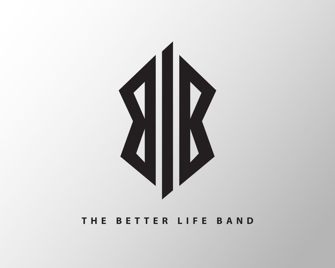
This was a logo clean-up. They loved the "blb" design concept but it was poorly done initialy.
I simply traced it, and straightened the lines, matched character weights, and made the angles on the l match at top of one "b" and bottom of the other. Previously both angles matched the first b, which threw off the balance.
Promotional Posters
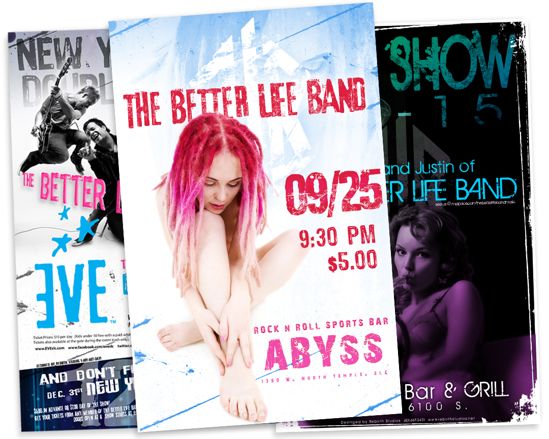
I designed 20-30 different posters for these guys over the years. These were for two consecutive annual events.
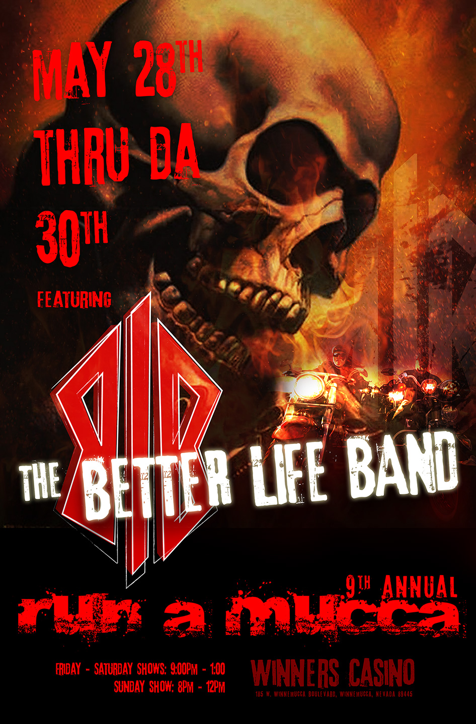
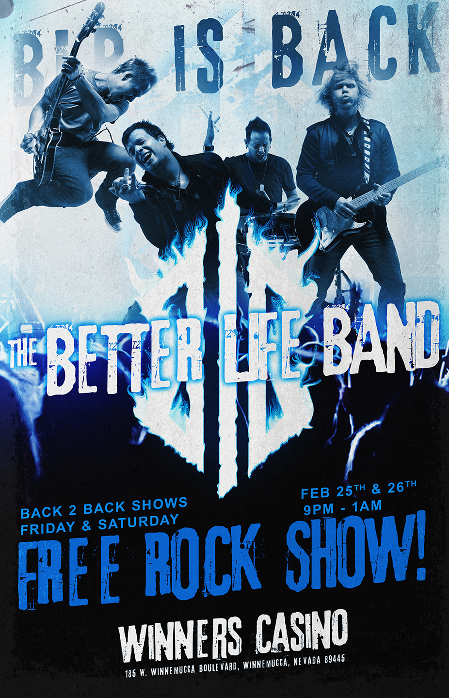
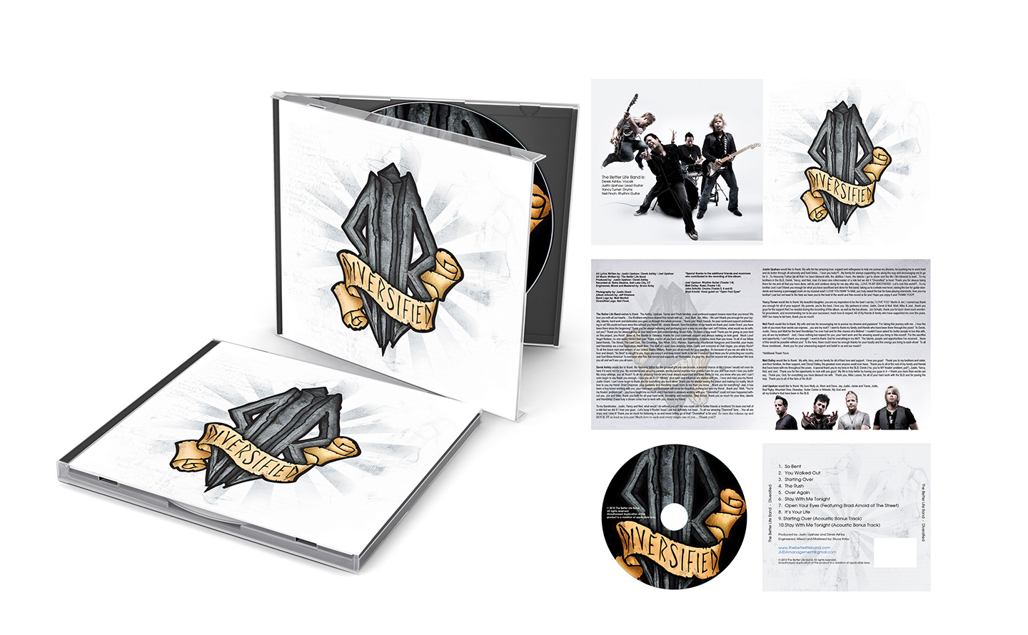
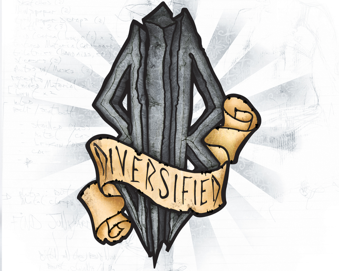
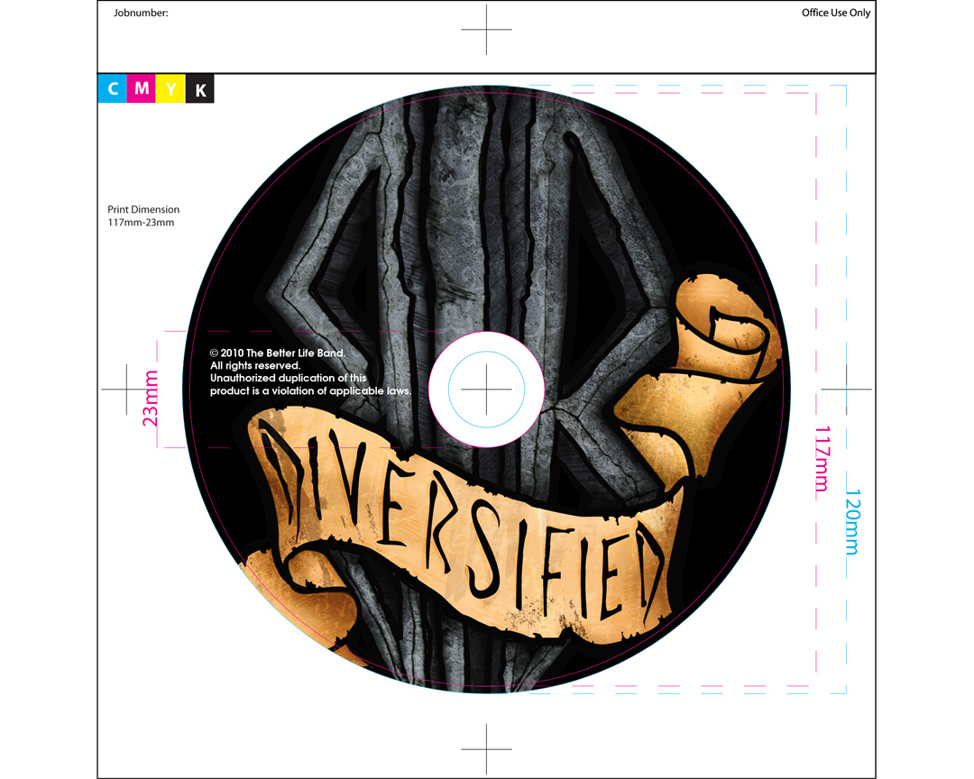
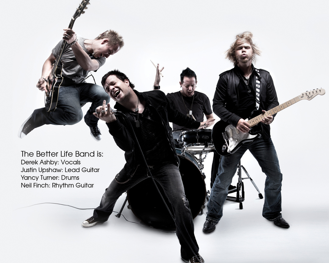
I also their created album covers, press kits, and visuals for their socials.